Project note /
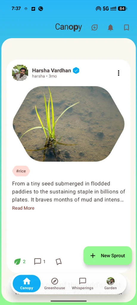
A useful plant journal entry needs context. A photo can catch your attention, but the grower, the plant, and the accompanying observation help you understand what you are looking at. The Canopy preview brings those pieces together in one post card.
 Enlarge screenshot
Observation before interaction
The card starts with the grower’s identity, then shows the seedling, a rice topic tag, and an excerpt. Discussion and saving controls sit below that observation. “New Sprout” is the visible creation action. This arrangement gives the plant update a readable sequence before asking the reader to respond.
“Sprout” is also a piece of product vocabulary. It connects with the botanical theme, but a new visitor still needs to understand that it means creating a plant update. The next review should ask whether a plain-language label or short explanation would make that action clearer.
Where the visual idea needs scrutiny
The photo has a rounded botanical crop rather than a rectangular edge. It gives the preview a recognizable character. It also raises a practical question: could the crop hide a leaf edge, symptom, or other useful detail? A journal image should remain inspectable in its original proportions.
The excerpt ends at “Read More.” A short excerpt keeps a feed manageable, but keyboard and screen-reader users need an understandable expansion control and reading order. Touch targets, text scaling, and contrast also need checking in the native clients; a website screenshot cannot establish their behavior.
The next review
A bounded review can start with this single screen: annotate unclear labels, identify anything the photo crop obscures, and suggest a clearer way to expand the observation. Then check those suggestions in an installable build when one is available. We have not presented user-study results or claimed that these choices are validated.
See the Canopy accessibility contribution brief, or explore the other PlantSpace previews.